
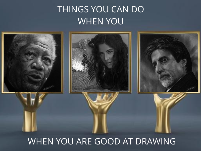
6 Portrait Drawing Mistakes You Frequently Make

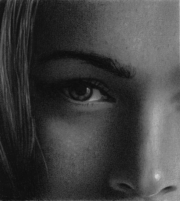
Portraits are by far the most popular forms of art, and artists prefer to learn the accuracy of portrait drawing. Even people choose portraits to capture someone on paper, to gift them, and to frame their loved ones. But as an artist, you might know how difficult it is to capture those emotions, that uniqueness of the person. For that, we have listed down some drawing mistakes which artists commonly do while drawing pencil portraits, along with some tips to avoid them.
Here are the 6 common drawing mistakes you frequently make
1. Midtones Are Important
Artists often underestimate the mid-tone area which accounts for a major part of the face in portraits. So, it is recommended that you use a B pencil for outlining the facial features. Next, switch to a 3B or 4B pencil for refining the mid tonal areas and adding value to the dark areas.
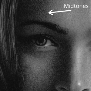
You can see the difference the mid-tones bring in your sketch.
2. Observe The Nostrils
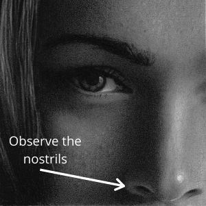
It is one of the most common drawing mistakes, is that we shade the nostrils as pure black in our pencil portraits. However, if you observe closely, you’ll find they are darker. So, to draw a realistic nose, observe the tones and shape of the nostrils as they aren’t pure black and circular in colour and shape. Also, you can use a mixture of dark colours to add more realism to your portrait.
3. Look In The Eyes
First of all, notice the proportions of the eyes, their placement, the thickness of eyelids, etc. and proceed accordingly. Also, notice the highlights on the iris and make them how they are, otherwise, your drawing will lack life.
If you observe closely, you’ll see that the iris is always covered by top or bottom or both eyelids. So, try to cover your iris and not make it properly round as it may look creepy.
4. Work On The Age
Probably the toughest part of a portrait is the skin, including drawing wrinkles on aged skin. So, it is necessary that they don’t appear too much, and that they go in sync with the rest of the portrait.
5. Don’t Give “Pure” Colours
For example, our teeth are not pure white, except for what they show in TV advertisements. So, to make your portrait drawing look realistic, give the teeth some tone with some shading. You can add some highlights too, to signify their reflective surface.
6. Understand the Light and Dark
One of the most common drawing mistakes is the value of light direction in a pencil sketch. As you’ll progress, you’ll get to know that shading dark areas as pure black would make your drawing look dull. Hence, you should shade such areas grey so that you can easily modify them. Once you have done it, your foundation of the portrait is ready and you can shade it further if you feel like.
Overall, to create an impactful and realistic portrait, you need to work on specific areas.
If you’re an artist and want to learn portrait drawing, join Pencil Perceptions to learn about such areas where you can get drawing lessons online and work on areas to improve.


