
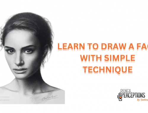
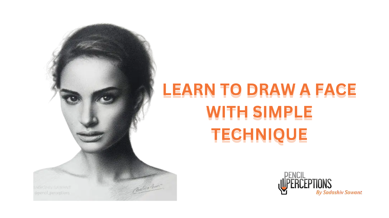
10 Reasons Why Your Drawing Doesn’t Look Realistic Drawing

If you’ve ever spent a lot of time to making Realistic drawings but you are disappointed because it doesn’t appear realistic and you have no idea why? Do not worry we have explain in detail but before that i share my story that how i learn portrait drawing. When I started my journey from being a completely different field to becoming an Artist, I spent a lot of years applying the technical knowledge in realism. I struggled to bring more life into my drawings because the technique and technical aspect was strong but the artistry was missing. Today I am sharing the drawbacks of why drawings lack realism as per my own experiences. Thousands of students have benefitted from our online sketching course which not only explains but demonstrates every lesson in detail.
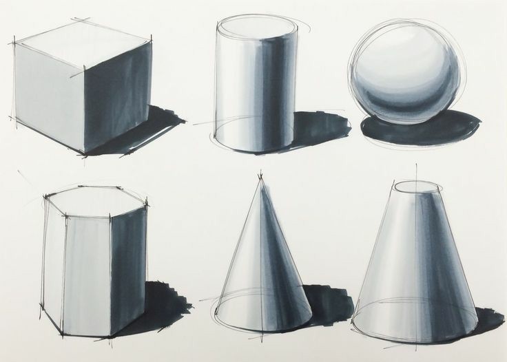
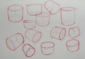
Lack of structural understanding
“All the visible world is only light on form.” – Andrew Loomis
So it is extremely important to study the form. Structural drawing helps us to understand how the object is, its dimension, how is it balanced, how are two objects overlapped and how does it look under light. A general structural knowledge can help you to add dimension. See and understand everything as 3D while drawing. In such a way, all your realistic drawing will have dimension and will not look flat. For portraits, study the anatomy. For objects, study the structure of it. For landscape, understanding the perspective and forms. Wireframe drawing is extremely important.
Out the outlines
To draw realistic Pencil Drawings, we use the drawing outline as a guideline. We often draw the outline so dark that it ruins the actual form or flow of the drawing. Hence it is necessary to out the outlines and know that our subject is an actual form and outlines are guidelines in the process.
Blending doesn’t follow the form
We want our drawing to look 3dimensional on a 2dimensional surface. And in order to that, we must wrap our blending strokes as per the form in order to create an illusion of form. When we shade is an opposite direction, it distracts the flow of the form and makes it much more difficult to create an illusion of depth. Adding up transitions as per the form makes it easier to show the anatomy of it in a simplified way.
Not enough contrast
Simplify your subject first by dividing it into big masses of light and shadow.
Adding up exact contrast will add an immense amount of depth and dimension which will make your drawing look realistic. How? We often fear to make it darker thinking it will spoil our realistic drawings. These thoughts hinder the contrast element because of which your drawing looks dull because of uncommitted tonal values.
Light coreshadows
Your Drawing might look nice, but due to inaccurate tonal play, it doesn’t look realistic. When the core shadow is lighter than actual, it takes away the spice of the artwork. It might overall look nice yet suffer from an unfinished illusion of depth.
Reflected light is too light
When you see a core shadow, look right next to it, for reflected light. We often make the primary light and the reflected light same. Always know that reflected light is an infirect source of light and cannot be as strong as direct light. When we make the reflected light equivalent to primary light source, your realistic drawing will loose the essence of naturalness. This small difference of reflected light can make or break your painting. Use it wisely and take advantage of It. Make it dark enough to be a part of the shadow and as a indirect light source.
Inaccurate values ranges
Realism is placement of right tonal values at right places. When the tonal values do not match as per the reference, it wouldn’t enhance your drawing. It will overall look scattered and dull. Use a value scale to crosscheck the tonal values. It helps you to take corrective measures to improve your work.
Lack of smooth transitions
There needs to be clarity with Artistry. When the tonal variations are soft, the shift of tones is gradual, the artwork looks qualitative and complete. Smooth transitions please the eye.
Lack of Quality Edges
Want to get an edge over other Realism artists? Then master the art of Quality Edges!
Realism need not be a one to one reproduction but a result of your highest interpretation with artistry. When we take a photo, it has no focal point and hence, everything looks like a cut paste copy of a reference. Edges are of three types: sharp, soft and lost edges. The area of focus must have sharp edges to turn up the contrast while others need to be soft or lost. Edges create an illusion of depth. You can master this skill by trusting your senses and experimenting. Try to seek your ultimate goal of Realism with this trick!
Lack of overall composition
Just drawing your subject with complete attention to detail and just “finishing up” the rest isn’t a good idea. The background must support the subject and create an atmosphere around it. Realism is not just reproduction. It is beyond it. It’s your introspection of how you feel and see and desire to present. Always have a background which supports your subject but does not overpower it.
With a lot of experimentation and practice, you will come up with one single formula that will be applicable for any subject you draw and this will help you go Beyond Realism. If you also want to learn to draw pencil art then you must join our Online Art Classes.


