
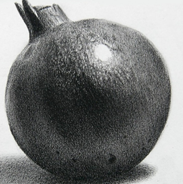
The impact of colours in painting, and it’s values in painting.


Colours are everywhere around us. And while the first thing we notice in a painting is its colour, we don’t realize that there’s a lot more we are taking in. Then it becomes imperative for the artists to use colours for their inherent qualities, towards a specific end. There are sketches we make just with the pencil. But we add colours in painting because they give meaning to them, and help in expressing an artist’s emotions and inspiration. Not just that, paintings are highly dependent on the colours to create impact, mood and depth. Even one tiny dab of bright colour on a monochromatic picture can create a different impact.
The Effect of Colours in painting
The effects of adding colour in a painting can vary depending on the colours used. They can be purely optical and catch your eye. Or they can be emotional, by creating a calming (blue/green)or stimulating (red/yellow) effect. Colours can create an aesthetic effect too, like the beauty you feel with the juxtaposition of harmonious colours.
Apart from that, a combination of hues, luminosity (degree of lightness or darkness) and chroma (purity of hue) also affect the viewer, keeping by the principles of colour theory and the layout of the colour-wheel. In addition, the neighbouring colours(or tones of the same colour) surrounding a particular colour influences how it is perceived.
Role of colours in painting
Colour in painting has two roles: describing and composing.
Colours describe a painting in 4 different ways:
-
Hue- use of the colour spectrum
This is the case when there are multiple tones of one colour in a painting. They appear in different colours but instead, they range on different ends of the colour spectrum. Colourful abstract art uses hue and colour spectrum to create a messy and meaningful artistic content.
-
Saturation- degree of spectrum purity
It refers to the degree of spectrum purity; low saturation means leaning towards neutral when colour compliments mix.
-
Temperature- warm to cool
Colours influence the mood; hence, they are classified into two groups: warm and cold. Warm colours are characterized by red, orange and yellow families. Cold colours incorporate blue, green and purple families.
-
Value- light to dark
The hue of the colour changes under direct light. Keep in mind this thumb rule: cool light produces warmer shadows and warm light produces cooler shadows.
Colour can change the composition of painting in five ways:
- By contrasting, to create harmony
- Unifying a scene
- Setting visual paths
- Producing rhythm
- Emphasizing
When we use colours not just to make our paintings look attractive, but to express, we give them soul and meaning. This way, we use the colours as composing tools and unlock a world of opportunity for creativity.
Pencil Perceptions provide you with the tools and knowledge about pencil sketching and colours. You can learn how to draw and paint so that you can explore and open up entirely new doors to creativity.


